Unified Dashboard Interface
The Mirenox dashboard brings together all your agricultural data in one organized view, making it easy to understand current conditions and track changes over time.
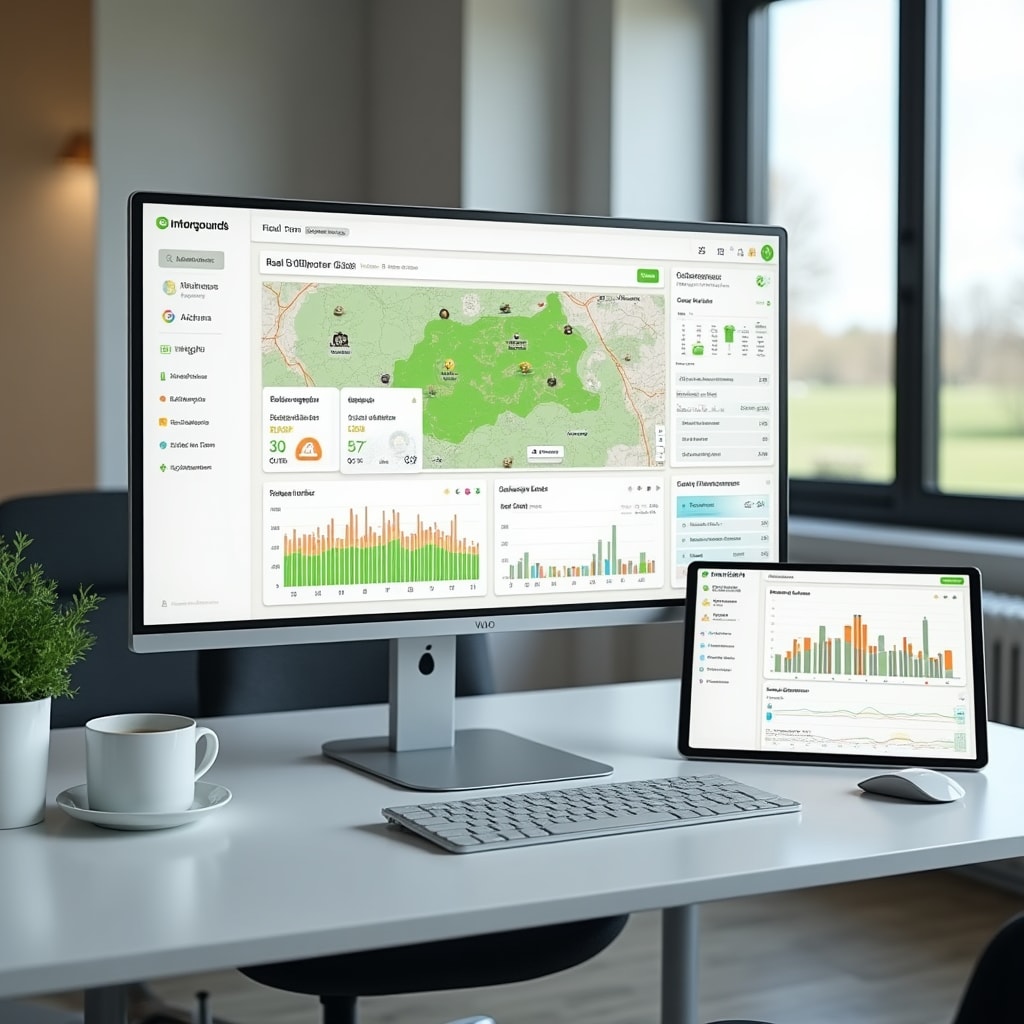
Dashboard Components
The interface is organized into sections that group related information, allowing you to quickly find the data you need.
Overview Panel
The main dashboard shows summary information across all data categories. Current weather conditions, recent soil measurements, and upcoming seasonal events are displayed prominently for quick reference.
Field Status View
Visual representation of your fields showing current crop status, recent activities, and any areas requiring attention. Color coding helps identify which sections need review or action.
Trend Analysis
Charts showing how key measurements change over time. Temperature trends, soil moisture patterns, and yield comparisons between seasons are presented in easy-to-read graphs.
Activity Timeline
Chronological view of all recorded activities and measurements. See what happened when, making it simple to track the sequence of events throughout the growing season.
Customizable Views
The dashboard can be configured to show the information most relevant to your operations. Arrange panels to prioritize the data you check most frequently, whether that's current weather conditions, soil status, or upcoming tasks.
Different dashboard layouts can be saved for different purposes. Create a planting season view that emphasizes soil conditions and weather forecasts, or a harvest view that focuses on yield tracking and quality assessments.
Filter data by date range, field location, or measurement type to focus on specific aspects of your operations. The interface remembers your preferences, so the dashboard displays relevant information each time you access it.
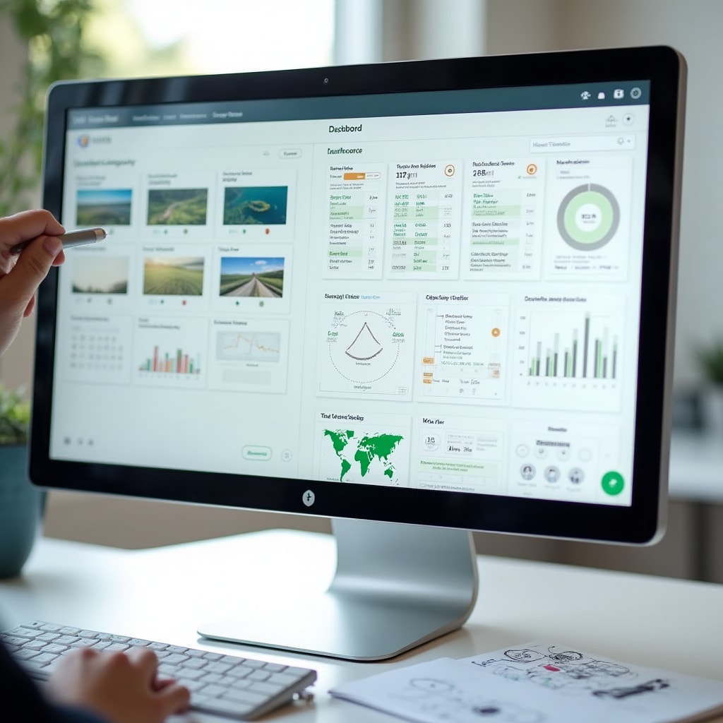
Data Visualization Types
Information is presented through various visual formats, each designed to make specific types of data easier to understand.
Line Graphs
- Temperature changes over time
- Soil moisture trends
- Rainfall accumulation
- Humidity patterns
- Growing degree days
Bar Charts
- Yield comparisons between fields
- Monthly rainfall totals
- Fertilizer application amounts
- Harvest quantities by variety
- Seasonal production summaries
Heat Maps
- Soil pH distribution across fields
- Moisture level variations
- Yield performance by location
- Temperature patterns
- Nutrient concentration mapping
Status Indicators
- Current weather conditions
- Irrigation system status
- Soil moisture levels
- Task completion tracking
- Alert notifications
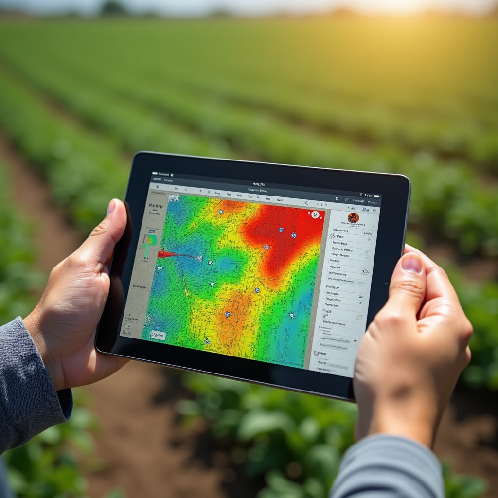
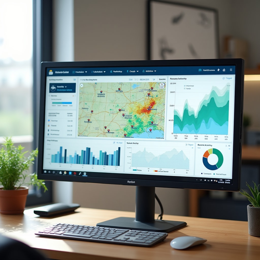
Interactive Field Maps
Geographic visualization of your property shows data overlaid on field boundaries. Click on any field section to see detailed measurements for that specific area. The map view helps identify spatial patterns that might not be obvious in charts or tables.
Different data layers can be toggled on and off, allowing you to view soil test results, yield data, or recent activities on the same map. Compare multiple data types side by side to understand relationships between different measurements.
The mapping interface supports both satellite imagery and simple field outlines, depending on your preference. Zoom in for detailed views of specific areas or zoom out to see patterns across your entire property.
Quick Data Entry
Add new observations directly from the dashboard without navigating to separate forms.
Quick Add Button
Click the add button from any dashboard view to open a simplified entry form. The form automatically includes current date and time, reducing the information you need to input.
Smart Defaults
The system suggests values based on your recent entries and typical patterns. Accept suggestions or modify them as needed for the current observation.
Immediate Update
New data appears on the dashboard as soon as it's saved. Charts and maps update automatically to include the latest information.
Photo Attachment
Add photos to any data entry directly from your device camera or photo library. Images are stored with the associated measurement for future reference.
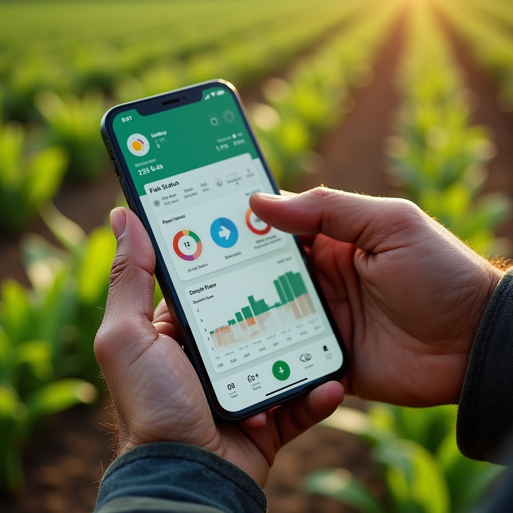
Dashboard in Action
The dashboard provides a comprehensive view of your farm data, updated in real-time as new information is added. All measurements, observations, and analyses are accessible from this central interface.
Mobile Dashboard
Access the same dashboard functionality from mobile devices while working in the field.
Field-Optimized Interface
The mobile dashboard adapts to smaller screens while maintaining access to all essential information. Swipe between different data views and use touch gestures to interact with charts and maps.
Large touch targets make it easy to add data or navigate between sections even while wearing work gloves. The interface prioritizes the most commonly accessed information on mobile devices.
Offline mode allows you to view previously loaded data and add new entries even without internet connection. Changes sync automatically when connectivity is restored, ensuring no data is lost.
Experience the Dashboard
Contact us to learn more about how the Mirenox dashboard can help you organize and visualize your farm data for better operational insights.
See the dashboard in action